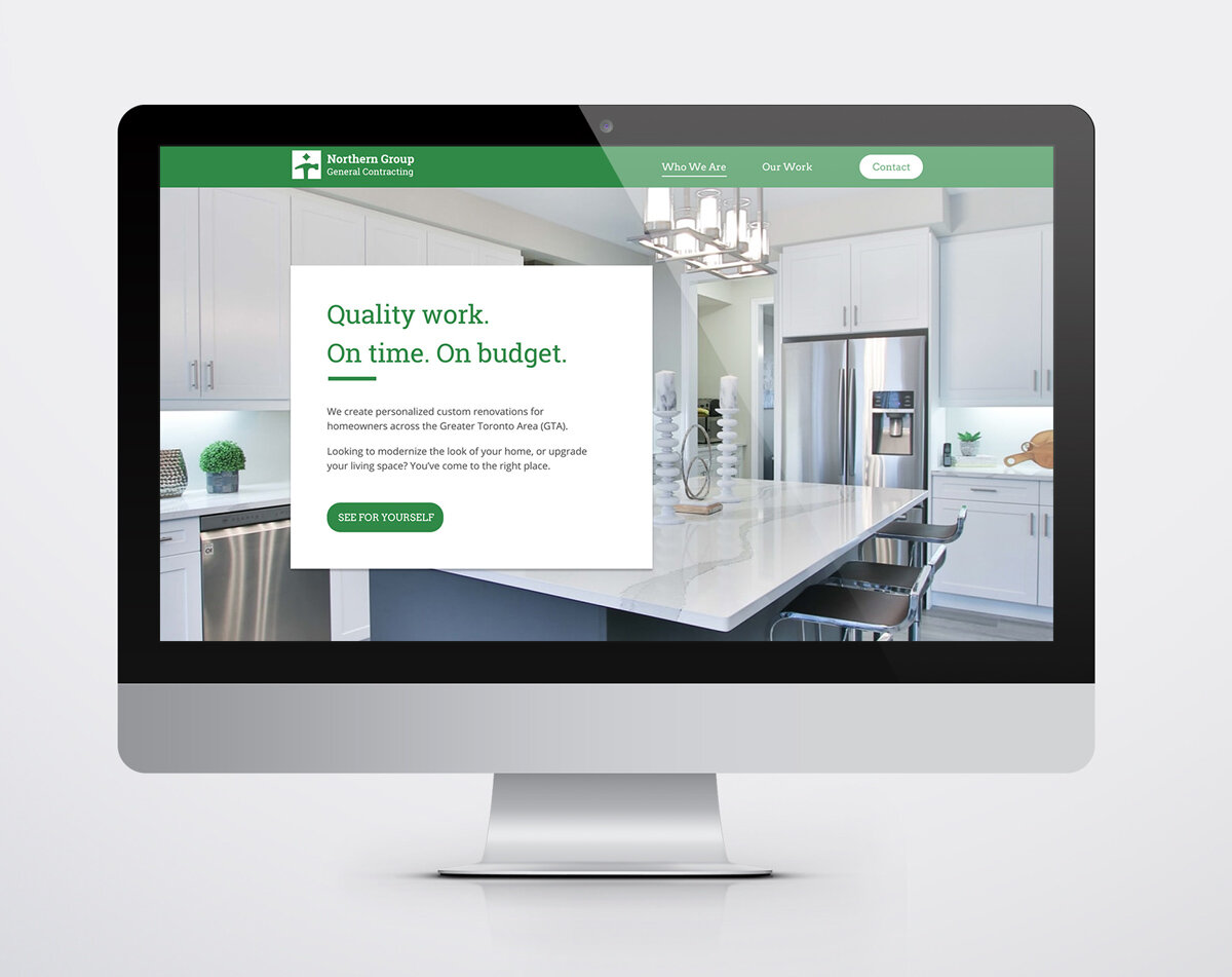
NGC Website Redesign
Project Goals:
Redesign the logo
Modernize the look + feel
Improve the UI/UX of the site
Optimize for maximum product exposure
Process:
First and foremost was the idea to showcase the company’s work and to push their portfolio of projects to the forefront. This was accomplished via minimal, open layouts that allowed for plenty of space for imagery. Multiple calls-to-action further assist in pointing the user toward gallery pages, where they could browse the company’s portfolio of past projects. Particular emphasis was also placed on the Contact button to motivate the user to contact the company, thus helping to establish potential contracts and drive sales.
A plain sans-serif (Open Sans) was paired with a serif (Roboto Slab). Roboto Slab lent the perfect balance of robust yet sophisticated, while Open Sans was easily legible and provided a crisp contrast against the slab-serif headers.
The logo redesign features a guiding north star above a hammer.
The project included the creation of various custom icons.


