CPF Website Redesign
Project Goals:
Modernize logo + logo font
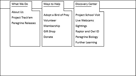
Overhaul site information organization + condense content
Strong emphasis on donations, user involvement, and latest news
The Process:
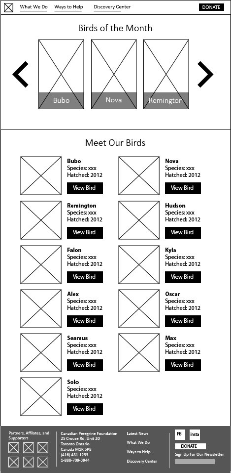
I began with jotting down all the site’s key information topics, then parsed them out into generalized categories. From there I consulted the primary goals of the project and built the website menu structure around optimizing those goals. Next, I wireframed out the key pages in Adobe Illustrator, ran them through a few rounds of feedback, and then began prototyping in Figma.
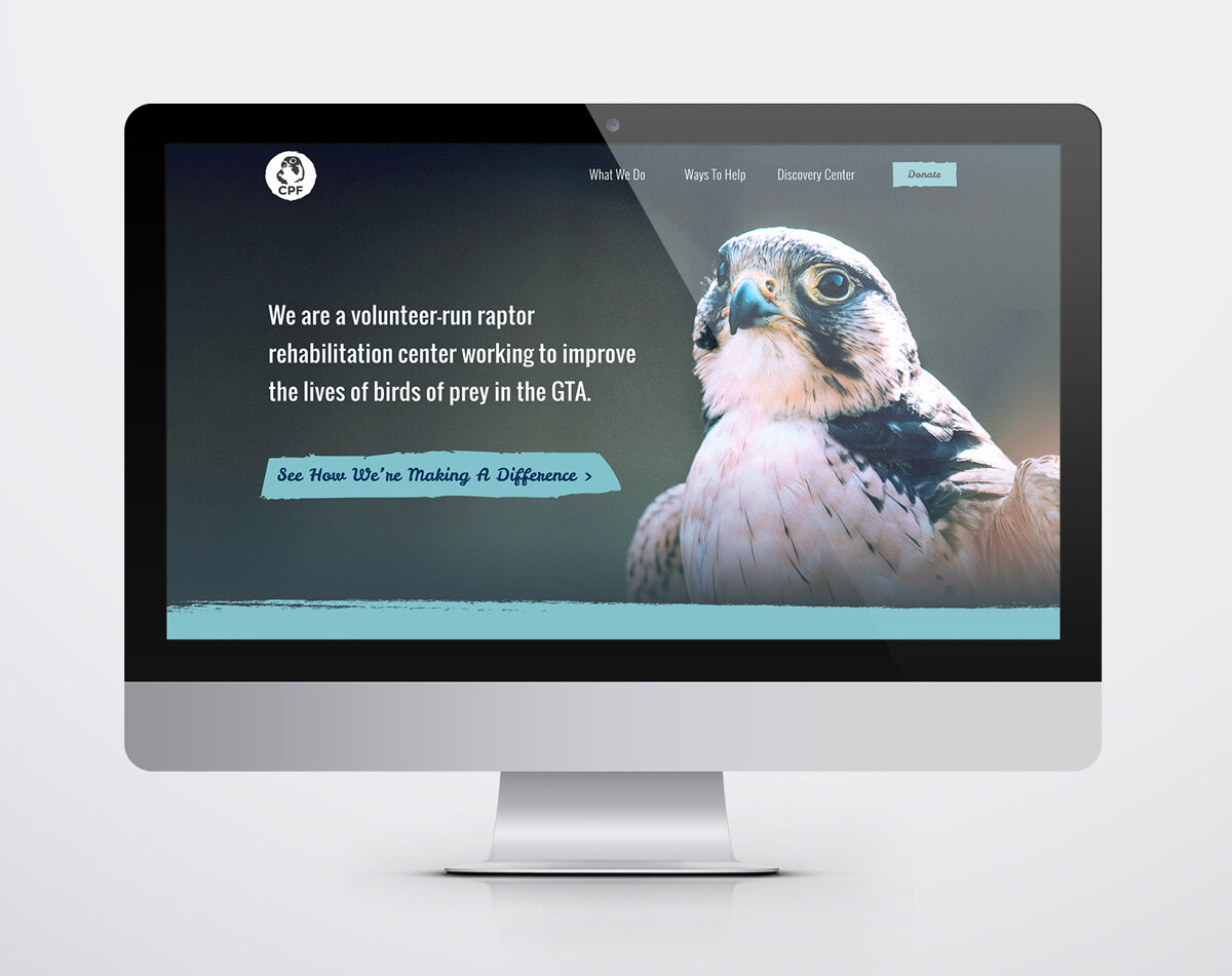
In order to encourage donations to the site, I employed a personable story-telling approach to the delivery of the site’s information. The ‘About’ section became ‘Our Story’, the ‘Birds’ section became ‘Meet Our Birds’. Birds were given their own little biographies and write-ups about their personalities and roles within the organization were key in drawing an emotional response from the user.
The modernized CPF logo features its titular peregrine falcon in a simplified vector format, with a clean + modern font choice that balances the image component.


