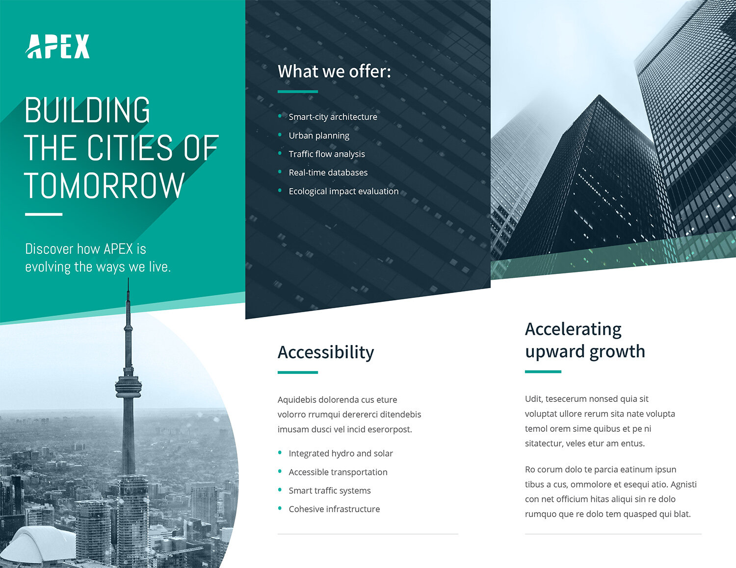
APEX Branding & Brochure Design
Project Goals:
This design exercise was an exploration on developing the APEX brand for use in a company brochure. The idea was to create a brochure that was modern, clean, and innovative.
In this branding exercise, my goals were to:
Create a company logo for an urban planning / architectural firm
Determine brand colours, image treatments, and typeface choices
Use open-source hi-res imagery
Incorporate all this into a z-fold brochure design
The Logo:
I wanted APEX’s logo to invoke the following themes:
Pinnacle of achievement
Brighter future; moving forward
Overcoming obstacles + challenges
To accomplish this, I used imagery of mountains to represent challenges faced, a summit to which to aspire, and a rising sun to hint at brighter futures. I also incorporated an arcing line within the logo text to give a sense of forward momentum and distant horizons. The typeface was modified to include some rounded corners, speaking to the company’s ability to adapt and evolve.


